How to Choose the Perfect Color Palette for Your Bathroom
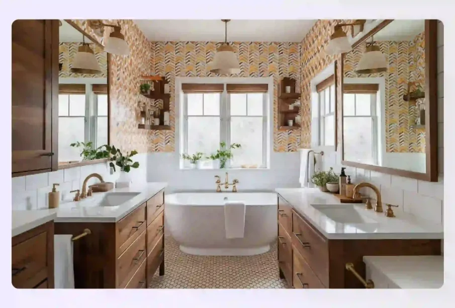
Selecting the right colors for a bathroom is about more than picking a favorite paint swatch. The bathroom serves as a functional room for morning routines and a private sanctuary for evening relaxation. The colors you choose influence the perceived size of the room, the quality of light, and the overall mood of the space.
Whether you want to build a spa-like retreat or make a bold statement, choosing an intentional color scheme requires balancing architectural elements, fixtures, lighting, and design principles.
Start with the Three-Color Rule
A reliable foundational framework used by interior designers is the three-color rule. This strategy ensures your bathroom feels cohesive, balanced, and visually interesting without becoming overwhelming. The rule relies on a specific distribution of tones throughout the room:
-
The Dominant Color (60 Percent): This color takes up the majority of the room. It is typically applied to the walls, large tile installations, or the main cabinetry. In most bathrooms, a neutral or light color is chosen as the dominant hue to maintain an open, airy feeling.
-
The Secondary Color (30 Percent): This shade supports the dominant color and provides contrast. It frequently appears on the vanity cabinet, accent tiles, flooring, or window treatments. The secondary color should complement the dominant choice while offering enough distinction to prevent the room from looking monochromatic.
-
The Accent Color (10 Percent): This is your boldest or most vibrant choice. It is used sparingly to draw the eye to specific areas. Towels, soap dispensers, small rugs, artwork, and even the finish of your plumbing hardware function as your accent color.
When you stick to this ratio, you create a natural hierarchy that prevents different design elements from competing against one another for attention.
Evaluate Your Bathroom Lighting
Lighting alters how a color behaves. A paint sample that looks like a crisp, clean gray under store lighting might look like a dull purple or a muddy blue once it is applied to your bathroom walls. Before committing to a color scheme, you must assess the sources of light in your room.
Natural Light
If your bathroom has large windows or a skylight, you have a lot of flexibility. North-facing windows emit a cool, bluish light, which can make crisp whites and cool grays feel clinical. To balance this, choose warmer neutrals or softer pastel tones. South-facing and west-facing windows provide warm, golden light, which enhances earthy tones but can make intense yellows or warm beiges look overly saturated.
Artificial Light
Many bathrooms lack windows entirely, forcing you to rely entirely on artificial light fixtures. The color temperature of your light bulbs plays a significant role here:
-
Warm White Bulbs (2700K to 3000K): These bulbs emit a yellowish glow that complements warm color palettes like beiges, terracotta, and soft creams. However, they can dull cool blues and crisp greens.
-
Cool White or Daylight Bulbs (4000K to 5000K): These bulbs mimic natural daylight and work beautifully with modern, cool-toned palettes like slate gray, crisp white, and navy blue. They can make warm colors appear washed out.
To ensure your palette works well, paint large test swatches directly on the walls and observe them at different times of the day with the lights turned both on and off.
Factor in Existing Hard Surfaces
Unless you are stripping the entire room down to the studs for a complete remodel, your color palette must cooperate with the elements that are already installed. Replacing items like a bathtub, shower surround, toilet, or countertop can be incredibly expensive, so it is wisest to build your palette around them.
Consider the Fixture Undertones
Most porcelain toilets, sinks, and tubs are white, but white is rarely just white. Some fixtures have cool, blue undertones, while older or traditional fixtures might have warm, almond, or biscuit undertones. Painting your walls a cool, bright white next to a warm cream toilet will make the toilet look aged and yellow. Match the undertone of your paint to the undertone of your major fixtures.
Analyze Tile and Countertops
Look at the prominent colors and veins in your countertops and tiles. If your vanity features a white marble countertop with gray veining, pulling that exact gray for your cabinetry or walls will create an instant, intentional connection. If your flooring features a warm beige travertine tile, lean into a warm palette with ivory, taupe, or soft sage green walls.
Select a Style and Mood
Different color combinations evoke distinct psychological responses and design aesthetics. Consider how you want to feel when you step into the room each morning.
The Spa-Like Oasis
To cultivate a tranquil environment, look to nature for inspiration. Soft, muted shades of green, seafoam blue, pale gray, and sand mimic the colors found at the beach or in a forest. Combining these colors with natural wood elements, like an oak vanity, reinforces the peaceful, organic atmosphere.
The Bold and Dramatic Room
Small powder rooms are perfect locations to experiment with high-contrast, moody colors because guests spend limited time in them. Deep charcoal, navy blue, forest green, and even rich black can create an intimate, sophisticated environment. When using dark dominant colors, balance the weight of the room with crisp white trim, large mirrors, and reflective metallic hardware to bounce light around.
The Clean and Timeless Look
If you are focused on resale value, a classic, neutral palette is always a safe choice. Shades of soft white, alabaster, greige, and light tan provide a clean backdrop that appeals to a wide audience. You can easily update the personality of a neutral bathroom over time simply by swapping out inexpensive items like towels, bath mats, and shower curtains for different accent colors.
Frequently Asked Questions
Should the bathroom color palette match the rest of the house?
The bathroom palette does not need to match your other rooms identically, but it should feel like it belongs to the same home. You can achieve this continuity by ensuring the undertones match or by using the accent color from your master bedroom as the dominant or secondary color in your master bathroom.
How do I choose the right metal finish to go with my color palette?
Look at the warmth of your colors. Warm palettes featuring beige, terracotta, and cream pair beautifully with brushed brass, gold, and oil-rubbed bronze hardware. Cool palettes with blues, grays, and true whites blend well with chrome, polished nickel, and matte black fixtures.
Can I use dark colors in a tiny bathroom without making it look smaller?
Yes, you can use dark colors in a small space. Dark colors recede visually, which can obscure the corners of the room and create an illusion of depth. To make this work, ensure you have excellent lighting, use large mirrors to expand the sightlines, and keep the ceiling a bright white to maintain height.
What paint finish is best for bathrooms?
Because bathrooms experience high levels of humidity and moisture, avoid flat or matte finishes on walls, as they absorb moisture and stain easily. Satin or semi-gloss finishes are ideal because they resist water, discourage mold growth, and are easy to wipe clean.
How do I choose a color palette if I have bright, mismatched accent tiles?
If you cannot replace the bright tiles, make them the official secondary or accent color of your room. Keep the remaining 60 to 70 percent of the room incredibly neutral with soft whites or quiet grays to tone down the intensity of the tile and make the design look intentional rather than accidental.
Is it a bad idea to paint a bathroom ceiling a color other than white?
Painting the ceiling a color can work beautifully depending on your goals. In a room with high ceilings, a darker color can make the space feel cozier. In a small powder room, painting the ceiling the same dark color as the walls creates a seamless canopy effect that hides spatial boundaries.